Still the same, your photo choice greatly impact the layout and design of your projects. Though I am no professional photographer, I do know a good photo when I see one! Here 3 tips to keep in mind the next time you find yourself playing photographer:
- Take high resolution photos. Set your camera to the highest resolution setting possible. 300dpi (dots per inch) is typically ideal. Though the higher the resolution the more memory is taken up on your camera or disk, the resolution then ensures flexibility in during editing. If you are sending your photo to a graphic designer for incorporation in a project, do not crop or edit the photo beforehand. Doing so will minimize his or her ability to crop and adjust the photo to fit on the page.
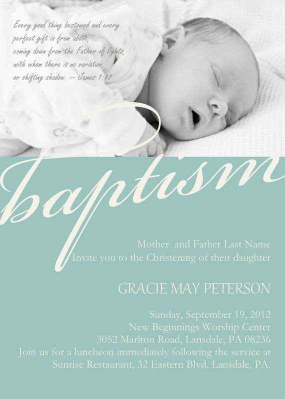
- Don't take tight shots. Those fun up close and personal photos from arms-length are cool for Facebook but they are awful for design purposes. The closer the shot the less room you have to move the photo around on the card for ideal positioning.
- Watch your lighting. Photos with too little light, not enough contrast, or faces with shadows don't produce very good photos. Most cameras have instructions about which settings to use in various settings. For instance, outdoor photos on a cloudy day require the lens setting to allow more light in than on a sunny day.
- Convey the right message. Family cards around the holidays, or engagement photo save-the-dates are all about love and togethernes and closeness. So hugging, touching, kissing (...when appropriate!) are great ways to convey the message of affection. Highlight your folks by keeping the background simple and making sure everyone is in the shot (...no, you shouldn't cut your mother in-law out on purpose...)
Cheers!
Diera
////////////////////////////////////////
facebook: /DiconshaDesigns
etsy: /shop/DiconshaDesigns
twitter: @DiconshaDesigns


